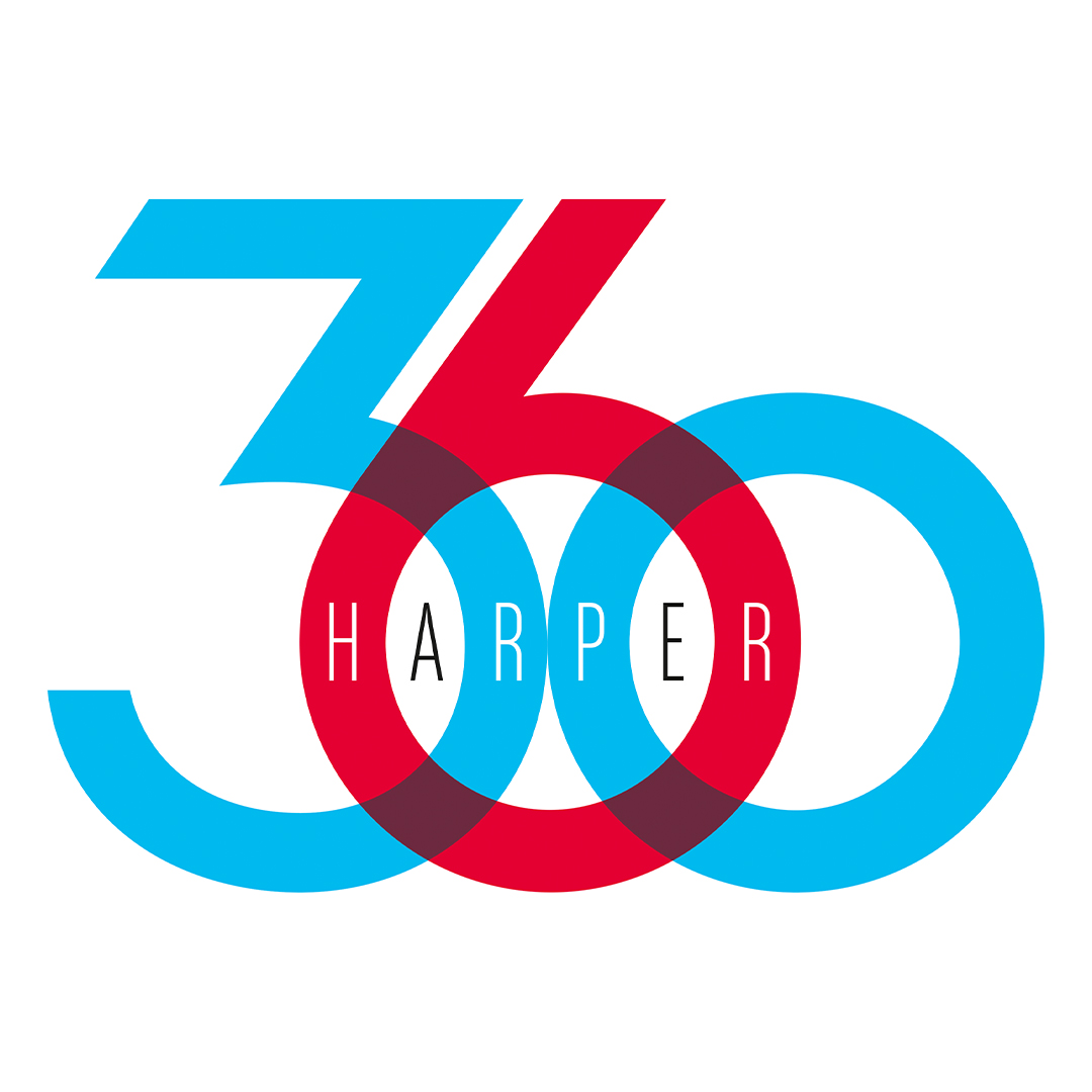
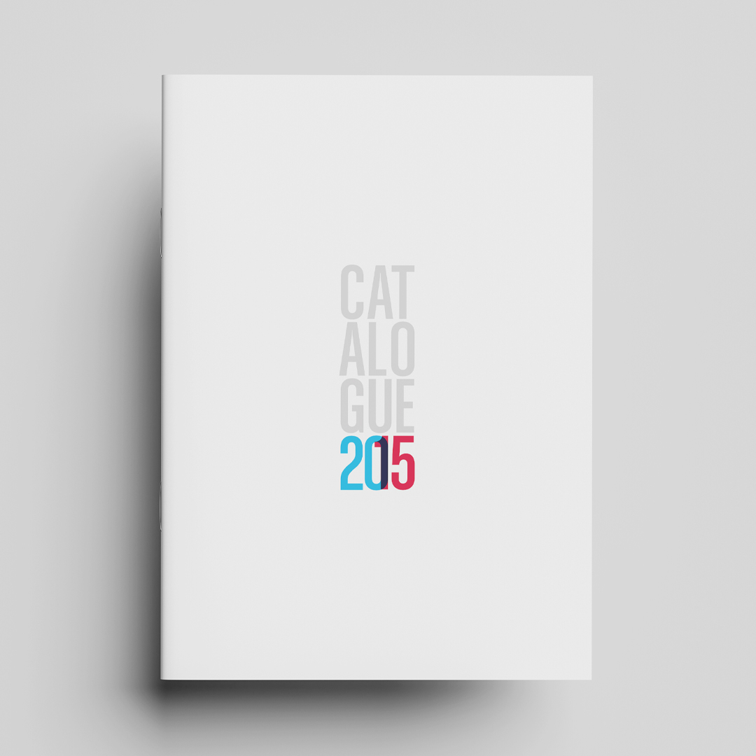
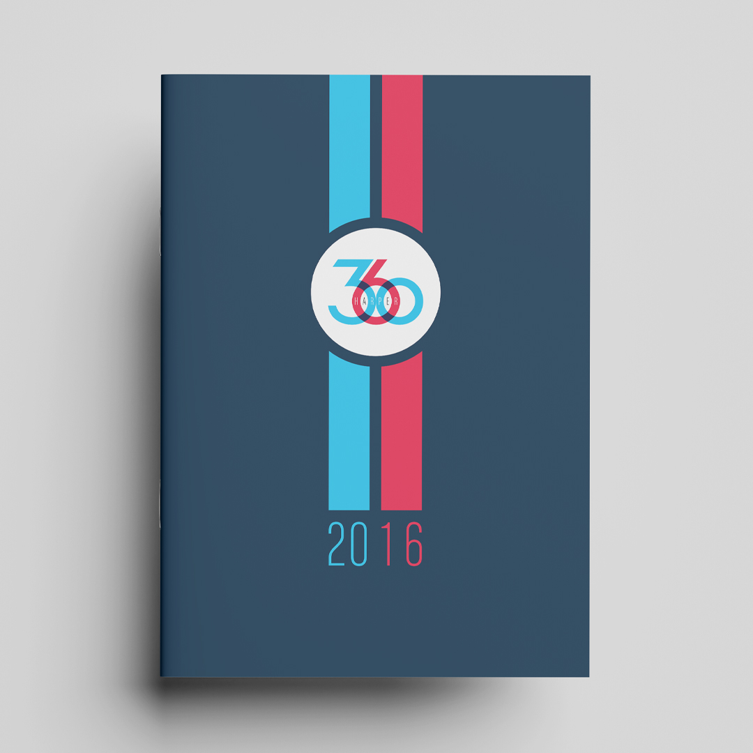
Harper 360 remains one of our favourite identity projects to date. Created as a global platform designed to unify rights across all HarperCollins authors worldwide, the original logo existed simply as a PowerPoint graphic — functional, but lacking the presence and flexibility the brand deserved.
We reimagined the identity as a living, adaptable mark capable of performing confidently across international markets, cultures, and platforms. By refining the relationship between the numerals, the logo became more than a name — it evolved into a visual representation of connection. Drawn closer together, the forms create a subtle link between global partners, reflecting the collaborative nature of the Harper 360 network.
The spacing was carefully considered to create a natural home for the Harper name, while the softer colour palette modernised the traditional HarperCollins red and blue into something more contemporary, approachable, and distinctive — balancing playfulness with authority.
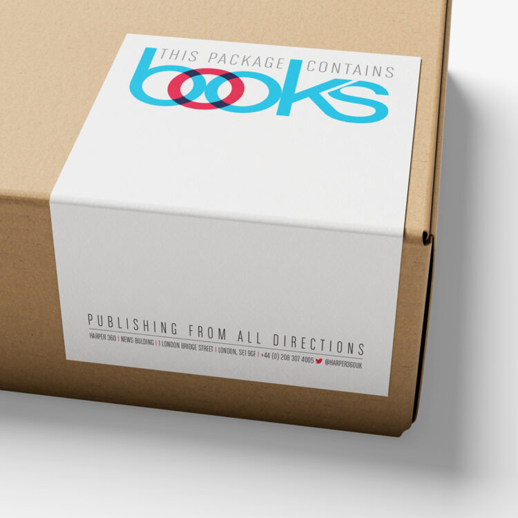
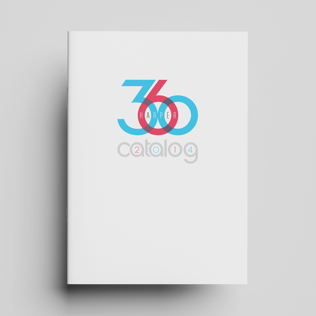
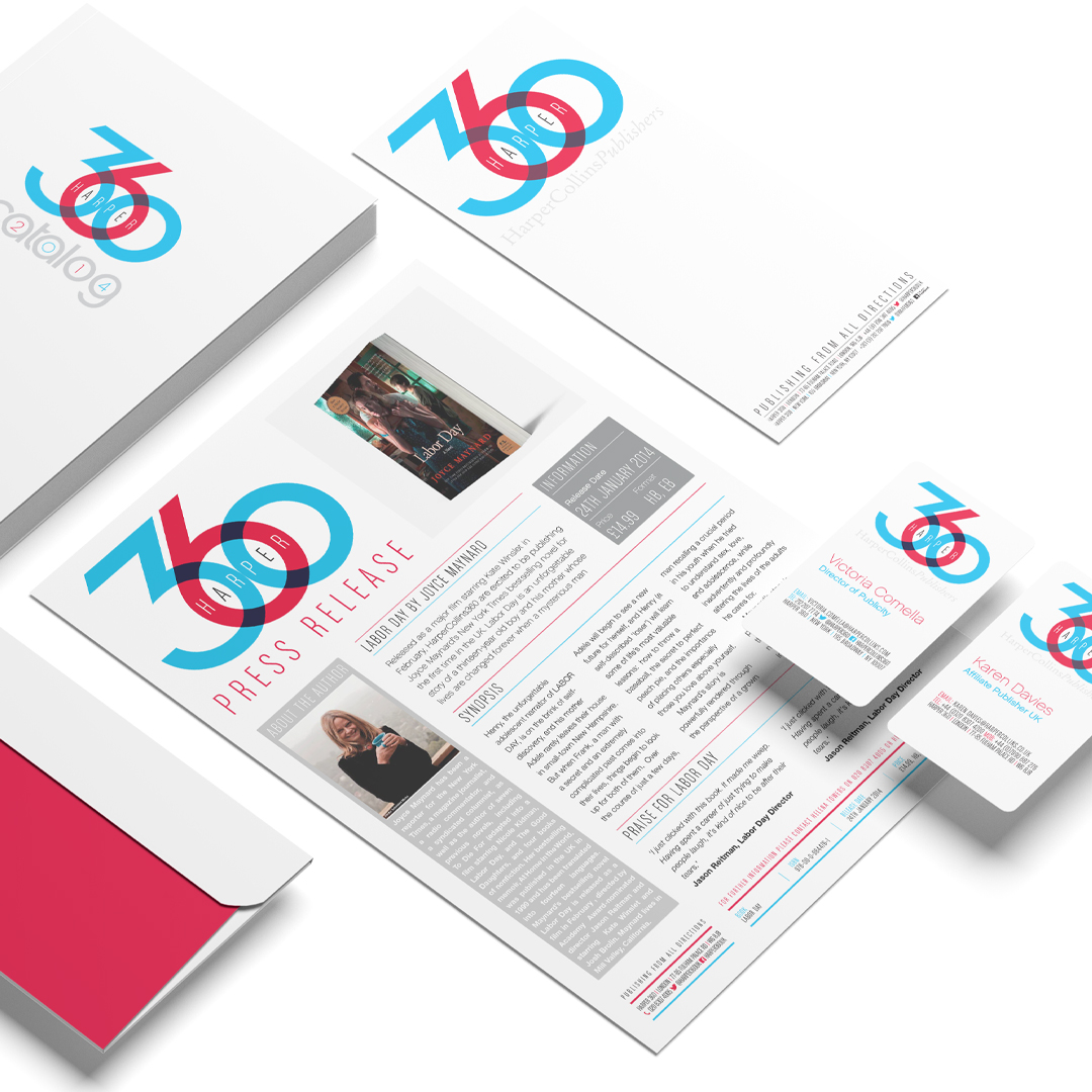
Today, Harper 360 sits confidently within the HarperCollins brand portfolio as a recognisable expression of its global publishing presence. The identity has expanded seamlessly across everything from email signatures and stationery to catalogues, business cards, and biannual presentations, giving the brand a stronger, more cohesive voice across every touchpoint.